Lighting Strategies for Creating a Cozy and Stylish Home
Lighting serves as a fundamental element in defining both the atmosphere and functional quality of an interior space. Whether the goal is to foster a warm, inviting ambiance or achieve a sleek, contemporary aesthetic, a precise approach to lighting design is critical. This guide provides an in-depth look at how to strategically implement lighting solutions to create interiors that are both cozy and visually sophisticated.
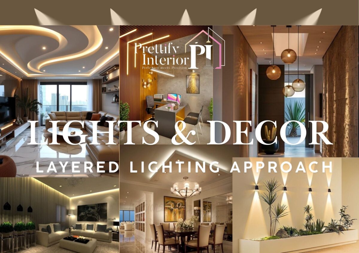
Layered Lighting Approach
A well-balanced lighting scheme relies on a multi-layered approach to deliver functional, versatile, and aesthetically pleasing illumination. This involves combining three essential categories of lighting: ambient, task, and accent lighting.
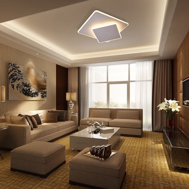
- Ambient Lighting: This foundational lighting layer provides uniform illumination across the space. Common fixtures include ceiling-mounted lights, recessed downlights, and chandeliers. For a cozy atmosphere, employ luminaires that emit warm white light (color temperatures between 2700K and 3000K), which replicates the warmth of natural sunlight during dusk.
- Task Lighting: Focused on enhancing visibility for specific activities (e.g., reading, cooking, or desk work), task lighting provides localized, high-lumen output. Desk lamps, under-cabinet LEDs, and pendant fixtures above countertops or workstations typically fall under this category. Optimal color temperatures for task lighting range from 3000K to 4000K, offering a crisp and clear illumination without causing glare.
- Accent Lighting: This layer adds dimension and emphasis by highlighting architectural elements, artwork, or textured surfaces. Techniques include the use of spotlights, LED strips, or wall-mounted sconces. Accent lighting introduces visual contrast and depth, enhancing the overall aesthetic of the room.
Technical Tip: To optimize control over the room’s ambiance, place each lighting layer on independent circuits or utilize smart lighting systems, allowing for precise modulation of intensity and effect.
Selection of Appropriate Luminaires
The choice of light fixtures not only serves a functional purpose but also contributes to the interior design. The following categories offer both illumination and visual enhancement:
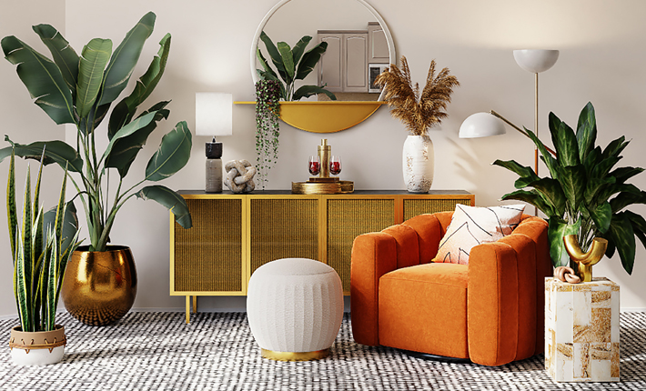
- Chandeliers: These central fixtures provide ambient lighting while functioning as design focal points, particularly in formal settings such as living rooms and dining areas. Select chandeliers that correspond to the spatial proportions and design theme to create harmony between form and function.
- Floor and Table Lamps: Versatile and mobile, these fixtures are ideal for creating low-level, intimate lighting zones, particularly near seating areas or in corners to soften spatial edges.
- Pendant Lights: Often suspended over dining tables, kitchen islands, or entryways, pendant lights provide concentrated illumination and an opportunity to introduce sculptural design elements. Choose materials such as matte metal, polished glass, or woven textures based on the overall style—whether modern, industrial, or rustic.
- Wall Sconces: Sconces are well-suited for ambient or accent lighting and are especially effective in hallways, bedrooms, or flanking mirrors in bathrooms. Their discreet nature allows for strategic placement to enhance spatial flow without overwhelming the aesthetic.
Dimming Controls for Dynamic Ambiance
Incorporating dimmer switches into your lighting plan allows for dynamic adjustment of light intensity. This not only provides flexibility in response to changing functional needs throughout the day but also facilitates the modulation of mood and atmosphere.
Technical Tip: Install dimmer switches for each lighting layer (ambient, task, and accent) to enable comprehensive control over lighting schemes, ensuring adaptability across various uses and times of day.
Importance of Color Temperature Calibration
Color temperature, expressed in Kelvins (K), significantly influences the perceived warmth or coolness of light. Selecting the appropriate color temperature is essential for achieving the desired ambiance in each room.
- Warm White (2700K – 3000K): Best suited for living rooms, bedrooms, and dining spaces where comfort and relaxation are prioritized. This range mimics the warm glow of candlelight or evening sunlight, promoting a sense of coziness.
- Cool White (3500K – 4000K): Ideal for task-oriented spaces such as kitchens, bathrooms, and home offices, where visibility and focus are paramount. Cool white offers clean, crisp lighting that enhances concentration without being overly harsh.
- Daylight (5000K – 6500K): Generally too intense for living areas, daylight bulbs are suitable for functional spaces like garages, workshops, or utility rooms where maximum visibility is required.
Technical Tip: Avoid mixing color temperatures within a single space, as it can disrupt visual coherence and result in an imbalanced lighting effect.
Enhancing Natural Light Ingress
Optimizing natural light can dramatically improve both the energy efficiency and comfort level of a space. Where possible, architectural strategies should be employed to maximize daylight exposure.
- Windows and Skylights: Large, strategically placed windows or skylights allow for substantial daylight penetration, reducing reliance on artificial lighting during daytime hours.
- Light Diffusing Window Treatments: Utilize sheer curtains or adjustable blinds that filter sunlight, preventing glare while maintaining natural light levels.
- Mirrors: Positioning mirrors opposite windows can amplify the natural light in a room by reflecting it, creating an enhanced sense of spaciousness.
Technical Tip: In spaces where natural light is minimal or absent (e.g., basements), use LED lighting with color temperatures calibrated to mimic daylight and counterbalance with warm, ambient lighting to avoid creating an overly sterile environment.
Statement Lighting as a Design Element
Incorporating statement lighting fixtures enhances the visual appeal of a space while providing necessary illumination. These fixtures double as both functional lighting and design statements:
- Geometric Pendants: Suitable for contemporary or minimalist interiors, geometric lighting fixtures offer clean lines and sculptural form while serving as focal points for dining areas or entryways.
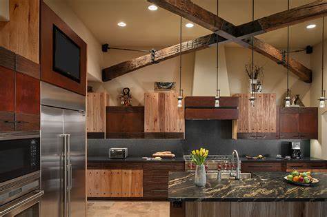
- Industrial or Vintage Fixtures: Exposed filament bulbs or metal fixtures add a nostalgic, yet stylish, touch to spaces like lofts or rustic dining rooms.
- Artistic Lamps: Sculptural table or floor lamps not only provide localized lighting but also act as art objects, adding an element of sophistication to otherwise utilitarian spaces.
Light and Texture Interplay
The interaction between light and surface texture can dramatically affect the perception of depth and spatial quality. Proper lighting techniques can accentuate textures, adding tactile richness to the environment.
- Wall Grazing: Direct lighting at textured surfaces, such as brick or wood paneling, to highlight their dimensionality. Wall grazing accentuates surface variations and enhances the overall visual interest.
- Uplighting: Uplights placed at floor level or behind furniture pieces wash light upwards, casting a soft glow that adds ambiance and a sense of height to the space.
Technical Tip: Careful attention should be paid to shadow formation, as improper lighting angles can create undesirable shadow patterns that detract from the intended aesthetic.
Room-Specific Lighting Recommendations
Each room presents unique functional and aesthetic lighting requirements. Consider the following tailored approaches:
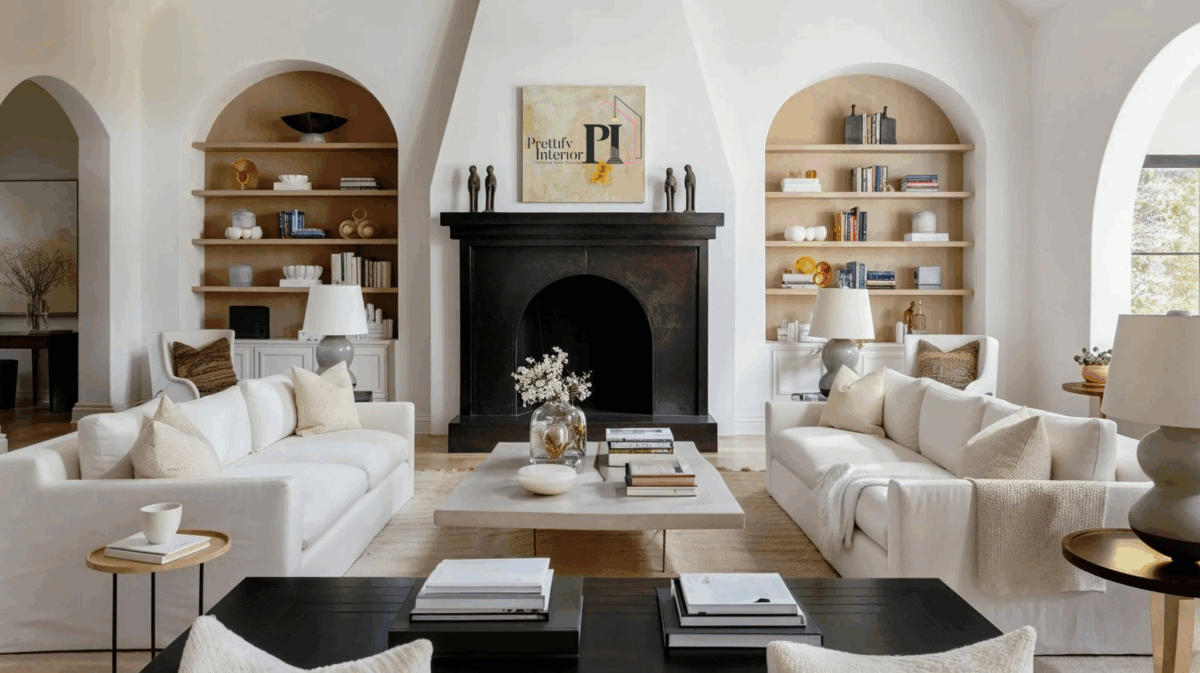
- Living Room: Use a combination of ambient, task, and accent lighting to provide flexibility. Dimmers are essential for transitioning between activities such as relaxation and entertaining.
- Bedroom: Prioritize soft, low-level lighting to create a tranquil atmosphere. Bedside lamps, sconces, or pendant lights are ideal for maintaining an intimate ambiance.
- Kitchen: Employ task lighting under cabinets and above work surfaces for functional illumination, while incorporating ambient ceiling lights to maintain overall visibility.
- Bathroom: Layer overhead ambient lighting with vanity task lighting and accent lights to create a balanced, spa-like atmosphere.
Conclusion
Achieving a cozy yet stylish home through lighting requires a methodical balance of functionality and design. Implementing layered lighting, selecting the appropriate luminaires, and fine-tuning color temperature and natural light sources are key to creating a harmonious and inviting ambiance. Through these strategies, you can optimize both the aesthetic appeal and functionality of your home’s lighting system, transforming any space into a sanctuary of warmth and style.